Tech
[Astro] GitHub-Like Alert Blocks Made Easy
Hint and warning blocks like GFM, or GitHub Flavored Markdown, are useful if you care about readability. Implementing them in Astro is almost too easy.
Note
This article was initially translated with GPT-5.5 and then reviewed and edited by the author.
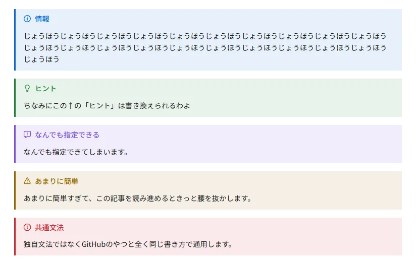
Suppose you want to implement something like this in Astro.
Information
information information information information information information information information information information information information information information information information information information information
Tip
By the way, the “Tip” text above can be changed.
You can specify anything
You can specify pretty much anything.
Absurdly easy
It is so easy that if you keep reading this article, you may fall out of your chair.
Common syntax
This is not some custom syntax. It works with exactly the same syntax as GitHub.
I once tried hard to implement this in Gatsby too, but there was nothing decent, and I gave up. Gatsby does not seem to behave properly unless it is a remark plugin with gatsby- attached to the name. With Astro, it was so easy to implement that I could not stop laughing.
How to do it
First, install remark-github-alerts.
bun i remark-github-alertsYou can of course use npm or yarn too, but if you still have not used Bun, convert immediately. It changes the world.
After that, import the plugin into astro.config.mjs and shove it in, or rather, add it.
import remarkGithubAlerts from 'remark-github-alerts';
export default defineConfig({  markdown: {    remarkPlugins: [remarkGithubAlerts]  }});
Incidentally, when I asked Gemini, it told me to install remarkAlert, but that is a trap. Do not obey it. If you do not want icons like  , that might be fine, though.
Finally, and yes, this is already the final step, tweak the CSS. Import the CSS in the frontmatter. Be careful not to import it inside <style> by mistake.
---import remarkGithubAlerts from 'remark-github-alerts';---After that, specify the color variables. Since they are specified on :root, it may be better to put them in a layout that is as close to the root as possible. Use whatever colors you like.
/* Light theme */ :root { --color-note: #0969da; --color-tip: #1a7f37; --color-important: #8250df; --color-warning: #9a6700; --color-caution: #d1242f; }I wanted to configure a dark theme and backgrounds, so mine ended up like this. Please learn how to implement the dark theme itself from some other article.
  /* Light theme */  :root {    /* ... */
    --color-note: #0969da;    --color-note-bg: rgba(9, 105, 218, 0.1);    --color-tip: #1a7f37;    --color-tip-bg: rgba(26, 127, 55, 0.1);    --color-important: #8250df;    --color-important-bg: rgba(130, 80, 223, 0.1);    --color-warning: #9a6700;    --color-warning-bg: rgba(154, 103, 0, 0.1);    --color-caution: #d1242f;    --color-caution-bg: rgba(209, 36, 47, 0.1);  }
  /* Dark theme */  .dark {    /* ... */
    --color-note: #4493f8;    --color-tip: #3fb950;    --color-important: #a371f7;    --color-warning: #d29922;    --color-caution: #f85149;  }
That is all you need to do. With just this, in any Markdown file where this layout can be applied, you should be able to summon a block by writing:
> [!NOTE] Put the title here> This is information.If you want to add backgrounds
This blog uses a custom layout that adds backgrounds to the hint blocks.
    /* Note */    .markdown-alert-note {      background-color: var(--color-note-bg);    }
    /* Tip */    .markdown-alert-tip {      background-color: var(--color-tip-bg);    }
    /* Important */    .markdown-alert-important {      background-color: var(--color-important-bg);    }
    /* Warning */    .markdown-alert-warning {      background-color: var(--color-warning-bg);    }
    /* Caution */    .markdown-alert-caution {      background-color: var(--color-caution-bg);    }
That is all. You should get a faint background color.
Astro is too easy
I am genuinely impressed that every kind of customization in Astro finishes so smoothly 
Tip
Turning this emoji into Twemoji was also extremely easy You can find out how if you search for it
Apparently, you can attach all kinds of remark plugins, so please make use of them.